 [dropcap]A[/dropcap]fter weeks of speculation, the Columbus Crew have finally completed their re-branding, and it appears to be, dare I say, a massive hit.
I was lucky enough to be one of hundreds that packed the LC Pavilion in downtown Columbus this evening and had a front row seat to watch the leadership of the Crew unveil the long awaited new logo that had been making waves in the Twittersphere under the hashtag of #NewCrew. Before we break down the logo according to what the Crew leadership explained to us, let me explain what the city of Columbus is like.
I’ve been a resident of the city for 15 years. This city is a cultural melting pot, but its background very much comes from a German heritage. The southern part of the city is famously known as German Village, paying homage to this background. While the Ohio State Buckeyes tend to get most of the attention, Columbus is very much a soccer city.
It has hosted some of the best USMNT matches there have ever been and even have the famed “Dos a Cero” history regarding the multiple 2-0 victories over hated rival Mexico. We here in Columbus truly believe that this is the home of the USMNT for this reason. Since the Crew’s inception in 1996, they have been a staple in regards to the growth of the sport in this country.
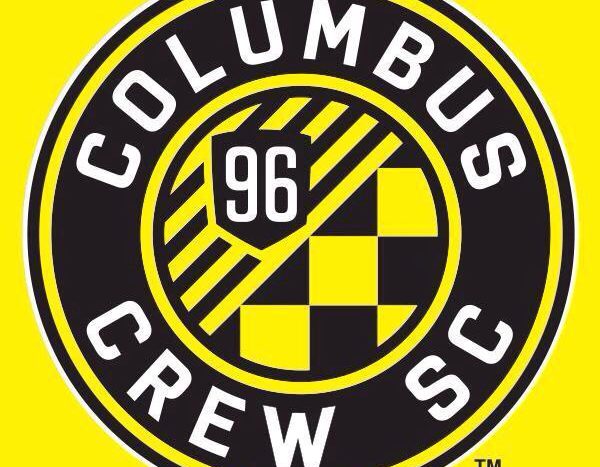
Anthony Precourt made sure that every detail was covered in the logo, so let’s break down the thought process.
1) THE CIRCLE: Influenced by traditional German soccer club badges, the circle gives a nod to Columbus’ German heritage.
This is spot on. Currently, the top flight of the German Bundesliga has 20 clubs. Of those 20 clubs, 12 clubs sport some form of a circular badge (Bayer 04, Bayern Munich, Borussia Dortmund, Eintracht Frankfurt, Freburg, Hannover 96, Hertha Berlin, 1. FC Koln, Mainz, Paderborn, Schalke 04, and VFL Wolfsburg) in their crest. The circular badge truly is a staple of German football, just like the German heritage is a staple of Columbus, so this was a no-brainer. The design of the crest almost immediately reminded me of UEFA powerhouse FC Bayern Munich with the design, and that is not a bad thing whatsoever.
2) INNER RING: This mirrors the “O” in the state flag of Ohio, of which Columbus is the capital.

Columbus Crew goalkeeper Steve Clark proudly wears the new badge. The Crew revealed that badge last night as part of their brand reveal. Photo/Sean Cahill
Simple decision to go with this, and I love the reasoning. Ohioans are proud of their state, and while I’m not a natural born Ohioan, I learned the respect people have for the state by attending The Ohio State University.
3) ORIGINAL CREST: The original crest pays tribute to our history as the first club in Major League Soccer, adorned with a “96” for the year the club and league were founded.
Whoever made this decision, give them a raise. The traditional design of the crest, or the shield as some have referred to it in the past, will always be remembered thanks to the logo. While some people weren’t a fan of the three construction workers, the crest was very traditional and clean. It makes me happy to see the crest retained in some form in the new badge. Excellent move.
4) DIAGONAL STRIPES: The crest is set atop nine diagonal stripes to represent the other charter clubs in the league and our vision for the upward growth of our club.
The stripes just work in this badge. The idea is beautiful to not only honor Columbus, but to honor the nine other clubs who paved the way for the growth of the sport in this country.
5) CHECKERBOARD PATTERN: A symbol of our passionate fans and their unwavering support, this pattern is deeply rooted in Columbus Crew SC fan culture and in soccer cultures around the globe.
I sit in the Nordecke, the supporters’ section of Crew Stadium. You will often see the checkerboard flags flying in this section to support the club. Supporters in the Nordecke can walk with their heads a little higher knowing that their passion was truly a part of the creation of this badge, and I’m certain that we’ll see new flags that will still have the checkerboard flag with the new badge slapped right in the middle of it.
I was very nervous for this night. The badge absolutely needed a change in the worst way, and Precourt’s team has knocked it out of the park. This is a badge that any team would love to have. It’s clean, sharp, and beautiful. I can only give one sentence to close this article out as the season presses on with a new branding:
Columbus til I die, Columbus til I die, I know I am, I swear I am, Columbus til I die!